Guest Booking Form & Account Area
Changing the labels on the guest-facing booking form and guest login
The guest facing booking form consists of the 5 main sections that helps to build up a booking.
Stage 1: Booking. This is the availability, the pricing and the party member breakdown.
Stage 2: Extras. Everything you are up-selling or collection additional information for a booking. We used to call these 'Add-Ons', so you may see references to this.
Stage 3: Your Party. If you wanting to collect the names of each person in your booking, it is in this section it will appear.
Stage 4: Checkout & Payment. At this point your guest is invited to either create an account or login. Then payment is collected by your chosen payment gateway.
Stage 5: Complete. Here is where the guest will be re-directed back from when they have made a payment.
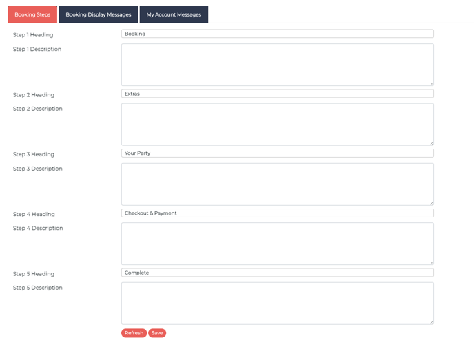
If you head to Guest Booking Form & Account Area (under Site setup) You can choose to change the headings on any of the 5 stages above.
You can also add a description to each heading. This will appear just underneath the heading title on the booking form.
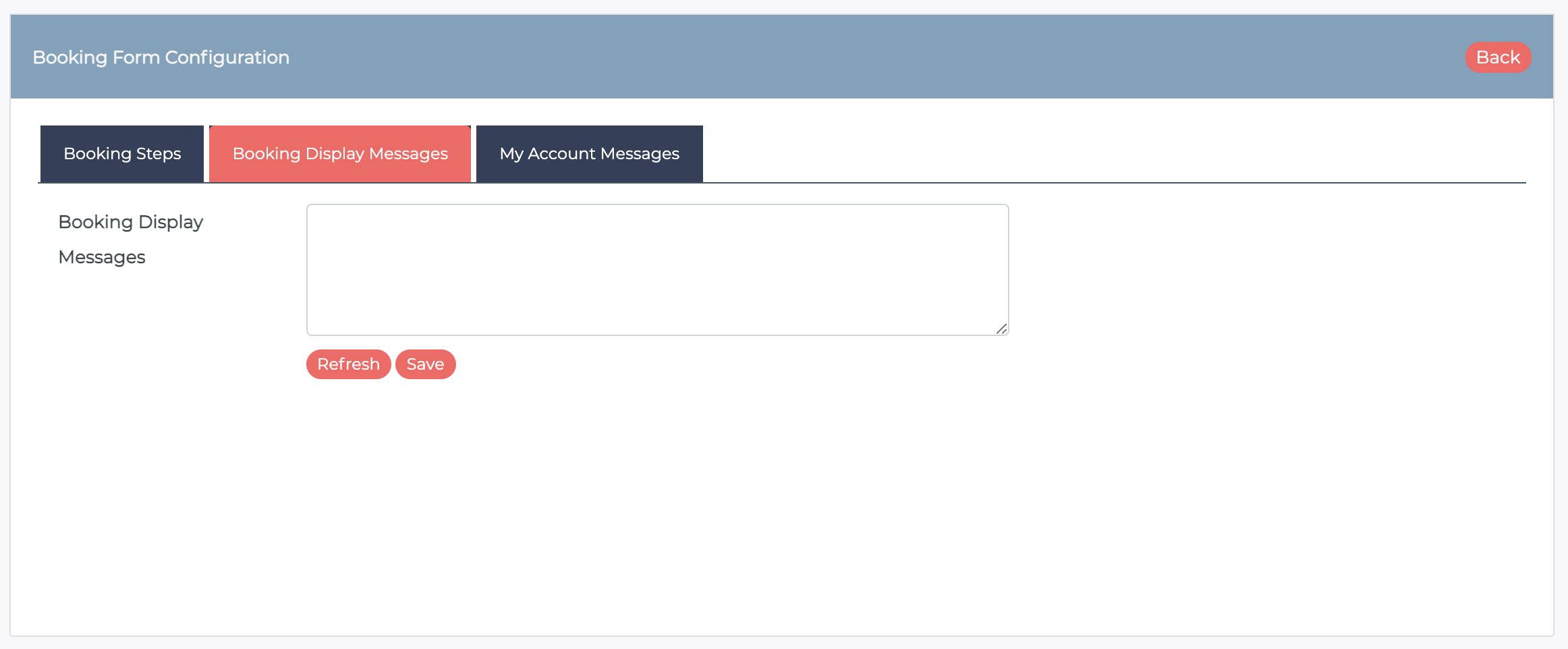
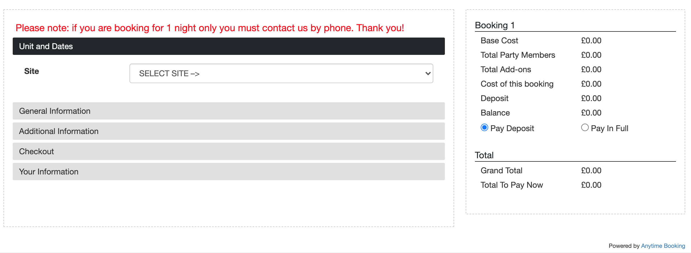
You can also write a display notice at the top of the booking form. This is useful when you want the guest to see a very obvious message at the top of the booking page.
It will appear in red at the top of the form. This is an example..
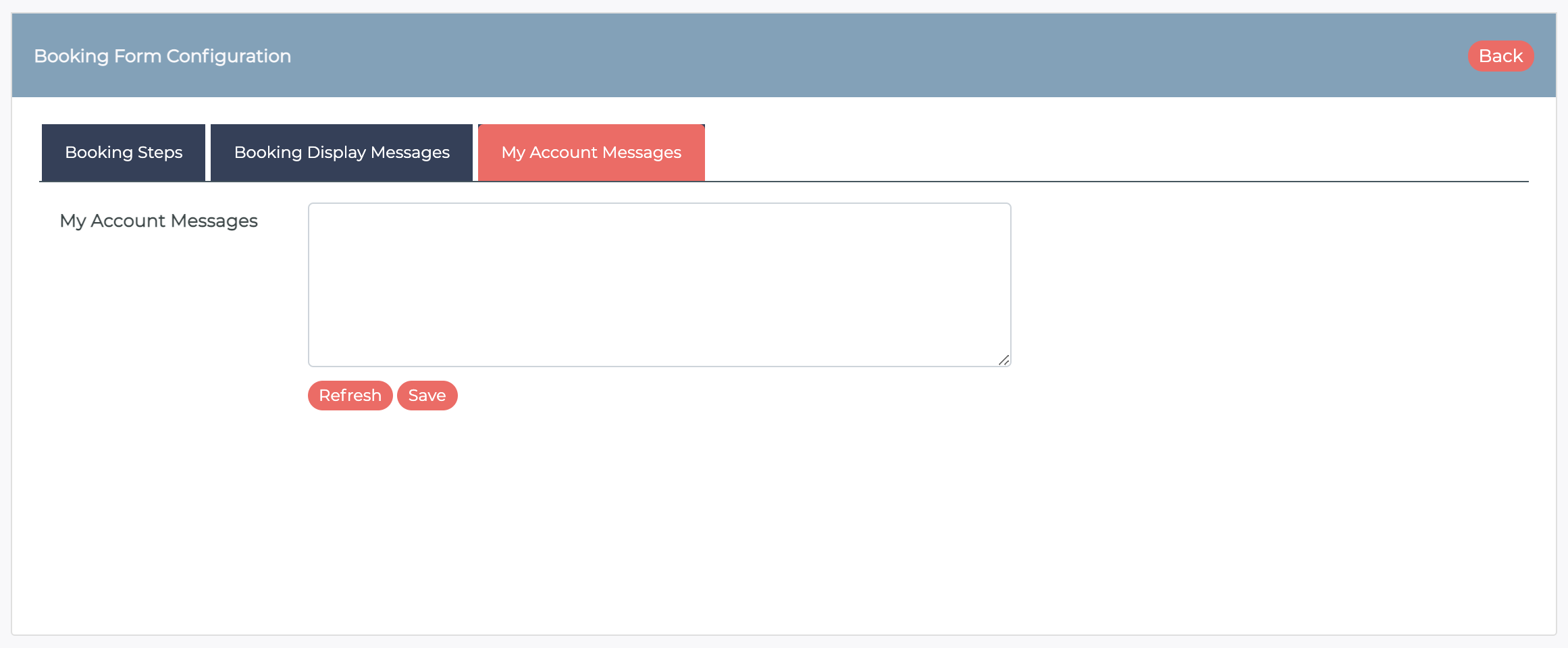
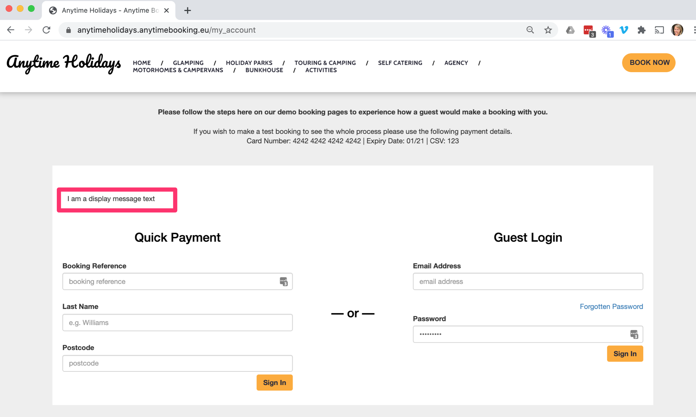
You can also write a notice on the guest login area. Here it is titled My Account Messages.
Any messages you write here, will appear at the top of the white space.
Custom HTML
Any of the configuration areas above can support any HTML adaptions if you wanted to change the colour, or hyperlink something.
